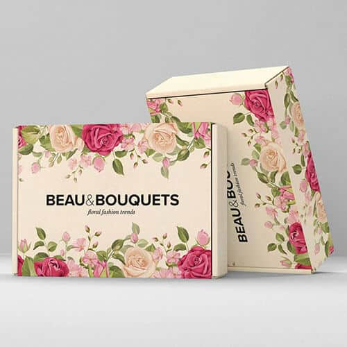
Close your eyes and picture a scene which brings you joy, relaxation or even stress. Unconsciously, your mind could associate these settings with a colour, and this is the same process which happens in the world of business. Whether it be on the high street or in a high-rise office block, our minds have a way of allowing us to feel certain ways about the things we see – including branding. This process is referred to as colour phycology, and when used correctly within marketing and advertising, there is a lot that can be achieved… trust us!
What is colour psychology?
To put it simply, colour psychology is the theory that colours have the ability to encourage a physical or emotional reaction. We don’t just mean that seeing red can bring on feelings of anger – it can supposedly also raise your blood pressure. According to Architectural Digest, your choice of paint colours is crucial in setting the tone of your premises, and it is the same with your business branding.
Examples of colour phycology
It is said that every colour, and every shade, has its own psychological impact, but let’s start with the primary colours…
- Red, associated with passion or urgency, has the ability to raise blood pressures and heart rates.
- Blue, associated with calmness and dependability, can have the opposite affect and lower blood pressure.
- Green, associated with relaxation and growth, can reduce feelings of worry or anxiety.
- Yellow, associated with warmth and happy energy, can encourage optimistic and motivated emotions.
How does colour phycology work in advertising?
Colour can have more of an impact in advertising than you may think. When seen in your logo, promotional materials or even your business premises, you can spark emotional responses in your customers and clients. Ultimately, these responses and emotions are what lead to decisions, and in turn, a boost in conversion rates for your business.
What to think about when using colour psychology in your own branding
When it comes to using colour psychology in your own branding, you will need to make logical and practical decisions that are right for your business. This includes making sure that:
- The colours you use are appropriate for your brand.
- The colours you use convey the tone and personality of your business correctly.
- The colours you use will appeal to your target market.
- The colours you use differentiate you from your competition.
At Printingprogress, our passion for print is of the same level as our knowledge. Whatever your question, don’t be afraid to ask. Get in touch and supply your brand with the right colour boost. Give us a call on 020 8290 1010 or send us an email at info@printingprogress.co.uk today to find out more about our expert colourful design and print services.


 Eco friendly, sustainably sourced recycled FCS certified print
 Takeaway Screens
 Postal Boxes