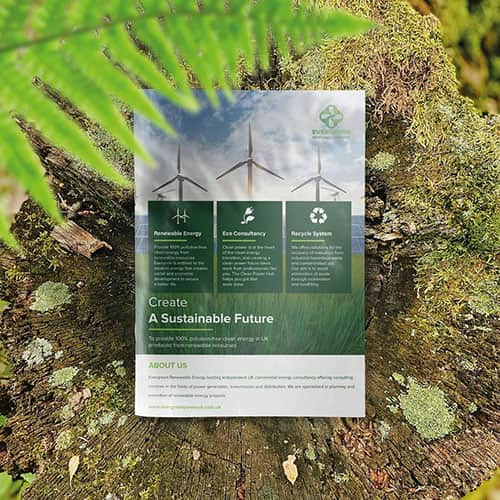
Flyers are among the most versatile and impactful marketing tools for promoting a business, event, or cause. Even with the shift towards digital marketing, a well-made flyer will cut through the clutter and attract people’s attention like no other medium. But how do you create an effective flyer design? It’s not just about having attractive graphics; the images, text, and layout all play crucial roles in ensuring the message is clear and persuasive.
In this guide, we’ll share flyer design tips and best practices for creating compelling flyers that captivate your audience and drive them to take action.
Ready to create attention-grabbing flyers that stand out? Contact our professional design team today at 0800 999 1094 or info@printingprogress.co.uk to bring your vision to life and make a lasting impression!
At Printing Progress, we understand that flyers are powerful marketing tools. We create eye-catching designs that effectively convey your message and help your brand stand out.
Quick Tips For Impactful Flyer Design
1. Start With A Clear Goal
Before embarking on the creative process, determining your flyer’s primary focus is essential. Are you announcing an event, publicising a promotion, or simply providing information about your business? Understanding your end goal is crucial for effective flyer design, as it helps you effectively shape your content and design elements.
Once you have a goal, consider what action you want your audience to take after seeing your flyer. Should they visit your store, call for more information, or follow you on social media? This desired action will influence everything, from your messaging to your call-to-action (CTA) placement.
2. Keep Your Message Concise And Focused
Flyers have limited space, so it’s best to be direct. Focus on one main message and communicate it clearly without adding unnecessary details. Do not convey too much information to your audience because it may mix up the message, thus lowering its effectiveness. Instead, deliver specific information via crisp, short sentences or bulleted sentences.
For a grand opening, include details like the date, time, address, and special offers. Highlight only the key elements that will engage your target audience and encourage them to act, creating attention-grabbing flyers that effectively promote your event.
3. Use An Eye-Catching Headline
The headline is crucial as it’s the first thing your audience will see, so it needs to be eye-catching and compelling. Use solid and big fonts and make it short and snappy.
For example, instead of using a generic headline like “Summer Sale,” go for something more specific and compelling like “Up to 50% Off On All Summer Styles—This Weekend Only!” This headline informs and creates a sense of urgency, encouraging the reader to act quickly.
4. Choose The Right Colours And Fonts
The colours and fonts also contribute significantly towards the effectiveness of your flyer. Try to use colours related to your brand and, simultaneously, appealing. For the best flyer design, contrast is crucial; for instance, the colour of the text must be different from the colour of the background to improve visibility.
Using two to three fonts is recommended to keep the text clean and organised. Choose one font for the headlines and subheadings and a more readable font for the body text. Avoid fonts with excessive curves or intricate designs, making the flyer appear unprofessional.
If you have any questions or need further assistance regarding our services, please visit our FAQ page here for quick answers and helpful information.
5. Include High-Quality Images
A picture is worth a thousand words, especially regarding the design of a flyer. This is why you should always use appropriate images of the highest quality that enhance the content of your message. For example, if you’re promoting a new product, it’s best to include an image of the product in action.
Consider using quality stock photos or high-resolution illustrations if you don’t have your images. However, be cautious, as these can sometimes feel generic and not align with your brand. Remember, pictures should complement your text, not overshadow it.
6. Balance Text And Visual Elements
A healthy balance between text and graphics is essential, especially when designing a flyer. Excessive text may bore some audiences, while excess images or decorative elements may dilute the concern.
Establish a structure whereby headlines will be in large fonts while the body will be in smaller fonts. Creating free space will prevent cramming and enhance the readability of the flyer, resulting in attention-grabbing flyers that effectively communicate your message.
7. Use A Call-to-Action (CTA)
All your flyers should have a clear CTA instructing what an audience should do next. The audience is also directed to take quick action with phrases such as “Visit Us Today”, “Call Now”, “Sign up for More Information,” etc. First and foremost, place your call to action where people can see it, that is, in the bottom or the middle of the flyer.
When promoting an offer or discount, include a CTA that supplements it. For instance, “Call Us Today and Get 20% off Your First Order!” The same goes for adding “Limited Time Only” or “This Offer Ends Soon”, which spikes your response rate.
8. Optimise For Readability
Readability is of prime importance in flyer design. Avoid big chunks of text, and where possible, use bullet points, numbered lists, and short paragraphs so that the information can be easily seen. Creatively, one can use spacing between sections to avoid congestion in the content.
Finally, the alignment of text and pictures creates a flow that moves the eye from one point to another without effort. A reader can then navigate through a well-structured flyer from the topmost heading to the call to action, wherever it is located.
9. Choose The Right Paper And Finish
The success of a flyer depends not only on its design but also on factors like the type of paper and finish used. Opting for high-quality paper gives the flyer a more substantial feel, which can enhance your brand’s image. A gloss finish helps make the colours appear sharper, while a matte finish offers an elegant appearance.
When preparing a flyer for a premium occasion or item, embellishments such as raised ink, metals, and textured papers can be incorporated for added value, contributing to the best flyer design that leaves a lasting impression and enhances the perceived quality of your brand.
10. Test And Refine
After finalising the flyer’s design, it is essential to evaluate its usability. Present it to some members of the target audiences and get their opinions. Are they able to understand the communication? Will the viewer’s eye be caught by the design? Get this information and improve your design before investing in mass printing.
Keep an eye on the response rate and determine how productive the flyer was as a marketing tool. Such information will be vital in making the following designs better than those done before.
CONTACT PRINTINGPROGRESS
Final Thoughts
One of the most important things, especially in advertising, is how to create impressive flyers. The flyer design tips above will contribute to making good flyers that grab attention and motivate the target audience to act.
Your audience deserves more than mediocre work. Join us for fantastic flyer designs that will increase your sales. Get in touch with us today.
For more information on creating impactful printed materials, including brochures that effectively convey your message, check out our comprehensive guide here.


 Eco friendly, sustainably sourced recycled FCS certified print
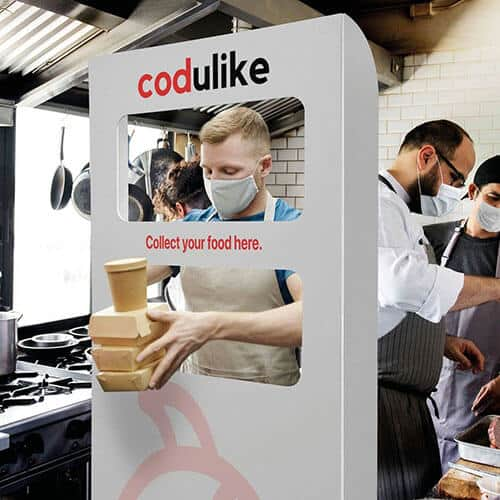
 Takeaway Screens
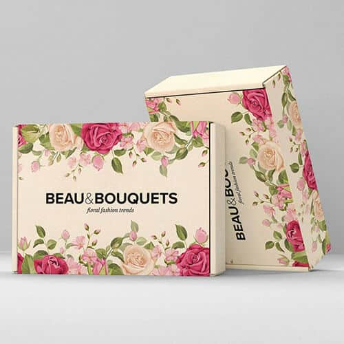
 Postal Boxes