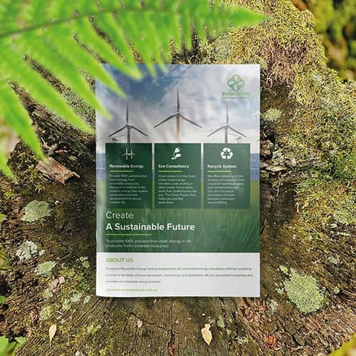
The struggle is real. You’ve poured your heart and soul into your business. You’ve tried everything—social media ads, email campaigns, even word of mouth—but your message isn’t reaching the right people. The frustration of being unseen in a crowded market is overwhelming, but there’s a solution that many businesses overlook: a well-crafted brochure.
A brochure isn’t just a piece of paper—it’s a silent salesperson, a 24/7 brand ambassador that showcases your business in a way no digital ad can. It’s something tangible that your potential customers can hold, flip through, and remember. But not just any brochure will do. Your brochure must be strategically designed to capture attention, tell your brand’s story, and drive action to stand out from the noise.
So, how do you create a brochure that doesn’t end up in the recycling bin? How do you design one that grabs attention, holds interest, and turns readers into customers? Let’s break it down step by step.
At Printingprogress, we specialise in creating professional, high-quality brochures that don’t just look good—they get results. Whether you need a sleek business brochure, a product catalogue, or a promotional leaflet, we’ve got you covered.
Let’s bring your vision to life. Call us today on 0800 999 1094 or email us at info@printingprogress.co.uk to start designing a brochure that makes an impact.
A great brochure doesn’t just inform—it inspires. It grabs attention, holds interest, and compels action. Let’s craft one that works for your business. Connect with us and our experts will help you design a perfect one.
How To Create An Effective Brochure That Attracts The Right Audience
Many small business owners struggle to attract customers despite trying various marketing tactics. A professionally designed brochure can change that. Unlike fleeting digital ads, a brochure is a tangible marketing tool that stays with potential customers, reinforcing your brand message. It provides essential information in a structured format, helping your audience understand your business and act.
Step 1: Define Your Objectives
Before designing your brochure, clarify its purpose:
- Who is your target audience? Understanding their needs will help shape your content.
- What key message do you want to convey? Keep it clear and compelling.
- What is the call to action? Do you want them to call, visit your website, or book an appointment?
A clear objective ensures your brochure delivers the right message to the right people.
Step 2: Plan Your Brochure’s Layout
Brochures come in various fold types—bi-fold, tri-fold, or z-fold. Each influences how information flows. Plan your layout carefully:
- Front cover: A striking visual and a compelling headline.
- Inside pages: Well-organised sections with concise text and engaging visuals.
- Back cover: Strong CTA with contact details.
Step 3: Focus On Readability And Design
Your audience will skim through your brochure quickly. Make sure it’s easy to read:
- Use short paragraphs and bullet points to present key information.
- Choose professional fonts that align with your brand identity.
- Maintain a consistent colour scheme for a polished look.
Step 4: Use High-Quality Images
Images can make or break your brochure’s impact. Avoid pixelated or stock images that lack authenticity. Instead:
- Use high-resolution photos that reflect your business.
- Consider custom illustrations to add uniqueness.
- Ensure images complement your text rather than overpowering it.
Step 5: Choose The Right Printing Finishes
The material and finish of your brochure influence how it’s perceived. Premium finishes enhance professionalism and durability. Consider:
- Matte vs. gloss finish – Matte gives a subtle, sophisticated look, while gloss adds vibrancy.
- Foil stamping printing – Adds an elegant touch to key details.
- Embossing and debossing – This creates a tactile feel that leaves an impression.
- UV coating printing – Enhances durability and visual appeal.
- Soft-touch coating – Provides a luxurious feel.
Step 6: Ensure A Strong Call To Action (CTA)
A brochure should motivate action. End with a clear CTA:
- Use phrases like “Book your consultation today” or “Visit our store for exclusive offers.”
- Provide contact details, including phone number, website, and social media handles.
How Can Professionals Help In Designing A Brochure?
Creating an effective brochure is more than just designing a good layout. Professional printing and design services ensure that your brochure stands out with a polished and strategic approach. Here’s how experts can help:
- Expert design assistance: Professionals understand colour psychology, typography, and layout techniques to make your brochure visually appealing.
- High-quality print materials: From paper stock selection to premium finishes, experts provide durable, high-end materials that elevate your brand’s image.
- Customisation & branding: A professional designer ensures that your brochure aligns with your brand identity, making it unique and recognisable.
- Print enhancement techniques: Professionals use advanced print enhancement methods like spot UV printing, embossing, and foil to add a touch of sophistication.
- Error-free & impactful copywriting: Well-crafted text is just as important as design. Experts ensure your message is clear, persuasive, and free from errors.
Get Expert Brochure Printing Services From Printingprogress
At Printingprogress, we specialise in creating high-quality, professional brochures that help businesses make a lasting impact. Whether you need help with design, layout, or premium finishes, we ensure your brochures attract and convert the right audience. Here is how we can help you out:
- Expertise in high-impact design – Our team crafts brochures that captivate, inform, and convert.
- Premium quality printing – We use high-quality materials and professional finishes for a lasting impression.
- Tailored to your brand – Every brochure is custom-designed to reflect your business and audience.
- Fast turnaround & reliable service – We deliver on time, every time, without compromising quality.
Call us on 0800 999 1094 or email info@printingprogress.co.uk to create a brochure that works for your business.


 Eco friendly, sustainably sourced recycled FCS certified print
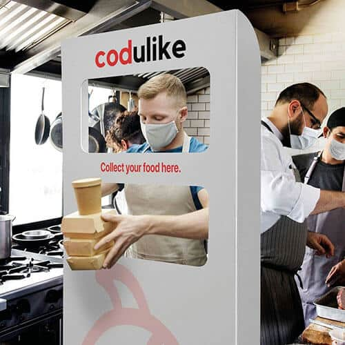
 Takeaway Screens
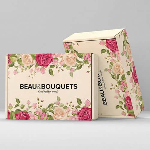
 Postal Boxes