Have you ever found yourself drawn to a product simply because of the colour of its packaging or advertisement? It could be a bold red sale sign that grabbed your attention or a calm blue logo that immediately made you trust a brand. Believe it or not, that reaction isn’t by chance. Colour psychology in print marketing plays a far more significant role than most people realise.
It has the power to influence how we feel, how we think, and even how we behave when we come across an advertisement or product.
So why does colour psychology matter in print marketing? Let’s dive into why your chosen colours can have such a big impact and how to use them strategically in your marketing materials.
At Printingprogress Ltd, we understand the importance of colour psychology and ensure that every project we undertake aligns with this principle.
Call us on 0800 999 1094 or drop us an email at info@printingprogress.co.uk to enquire about our extensive printing services.
Want to ensure your brand's colours leave a lasting impact? At Printingprogress Ltd., we specialise in maintaining consistent colour psychology across all your print and branding materials, helping you build a strong, recognisable identity that resonates with your audience.
Understanding Colour Theory In Marketing
When discussing colour theory in marketing, we’re looking at more than aesthetics. Colour theory is a set of principles explaining how different colours interact with one another and their psychological impact on the people who see them. Simply, it’s about understanding how colours influence emotions, thoughts, and behaviour—whether you’re designing a flyer, a brochure, or an entire advertising campaign.
The emotional impact of colours is deeply ingrained in our culture and personal experiences. For example, bright red and orange evoke excitement, urgency, or energy, while more subdued tones like blue and green are often associated with trust and calmness.
The Emotional Impact Of Colours In Print Marketing
Colours are far more than just visual elements—they have a profound emotional effect on us. When it comes to print marketing, the colour psychology in branding is something brands need to consider very carefully. After all, your colours could be the key to triggering a positive emotional response that drives a customer to buy your product.
For example, suppose you’re advertising a summer sale. In that case, use vibrant reds and yellows, as these colours are energetic, attention-grabbing, and evoke a sense of excitement and urgency. But if you’re promoting a product about wellness or relaxation, like a spa treatment or yoga brand, softer greens and blues can help convey calmness, trust, and healing.
Understanding how different colours stir specific feelings allows businesses to create advertisements that connect with customers more deeply, making them more likely to respond positively to the message.
Branding And Colour Choices
Branding and colour choices go hand in hand in shaping how a brand is perceived. The colours a company chooses for its logo, website, and advertising materials become part of its identity—sometimes even more so than the brand name itself. Think about some of the world’s most recognisable brands. Coca-Cola uses red to evoke excitement and energy, while Tiffany & Co. sticks with an elegant shade of blue to reflect luxury and sophistication. These colour choices are no accident; they’re deliberate, carefully thought-out strategies based on colour psychology.
When a business selects its colours thoughtfully, it can communicate its values and message more effectively to its audience.
By aligning colour choices with the brand’s personality, businesses can build a consistent visual identity that resonates with their target audience, ensuring greater recognition and trust.
Print Advertising Colours: Capturing Attention And Communicating A Message
Capturing attention is essential. Every day, people are exposed to countless ads—whether on billboards, in magazines, or on their doorsteps. How do you make your ad stand out in such a crowded space? Colour plays a huge role in this.
Bright, bold colours often stand out in a sea of neutral tones and can draw a person’s eye to your print advertisement. Think of a neon pink “SALE” sign—it’s hard to ignore, right? Effective colour combinations are key here.
Using the right colour combinations ensures that your print marketing materials’ key messages are eye-catching and easy to absorb. It’s not just about being bold—it’s about being smart with your colour choices.
Consumer Behaviour And Colours
When we talk about consumer behaviour and colours, the link is undeniable. Colours can influence purchasing decisions in subtle but powerful ways. Studies have shown that people often make snap judgments about a product based on its colour, sometimes in as little as 90 seconds. That means the colours you choose in your print marketing could directly affect whether or not someone decides to buy from you.
For example, deep, rich colours like black or gold can invoke feelings of sophistication and exclusivity if you’re designing for print. Meanwhile, if you’re targeting a younger, more energetic audience, bright colours like turquoise or orange may communicate fun, excitement, and vitality—traits they may associate with your brand.
When you understand the psychological effects of colours on buyers, you can tailor your marketing materials to resonate with your audience’s emotional triggers and motivations, increasing the chances of a successful campaign.
Colour Symbolism In Advertising
Colours are rich with symbolism, which can profoundly impact how your advertising is received. Different colours carry specific meanings and cultural associations that can communicate your brand’s values without saying a word. For instance, red can represent passion and energy, while blue might convey trust and dependability.
It’s essential to understand the power of colour symbolism in advertising. Green might be your go-to choice if you’re marketing an eco-friendly product, as it symbolises nature and sustainability. If you’re selling a product related to luxury or premium quality, gold, silver, or black can help communicate exclusivity.
Colour Trends In Marketing: Staying Relevant
Like fashion, colour trends in marketing evolve. Trends are influenced by societal shifts, technological advances, and changing consumer preferences. Keeping an eye on colour trends allows businesses to remain fresh, modern, and in tune with what appeals to their audience.
For example, pastel colours have become popular in beauty and fashion marketing in recent years, conveying softness and a modern, youthful vibe. Staying updated with colour trends ensures your marketing materials feel current and relevant to your audience.
CONTACT PRINTINGPROGRESS
Reach Out To Printingprogress For All your Print Related Services
Colour psychology is a crucial element in print marketing that can’t be overlooked.
From building a brand identity to influencing purchasing decisions, colour is a powerful tool that can help companies succeed in a crowded marketplace.
We at Printingprogress Ltd understand how crucial the perfect colour psychology is for any brand. Colour psychology plays its role in building identity and trust. Printingprogress ensures a consistent colour theory is maintained no matter your print requirements.
Contact us today for all your printing and stationery needs.
So, the next time you’re designing a print ad, take a moment to think about the colours you’re choosing—they might be the key to your marketing success.

 Eco friendly, sustainably sourced recycled FCS certified print
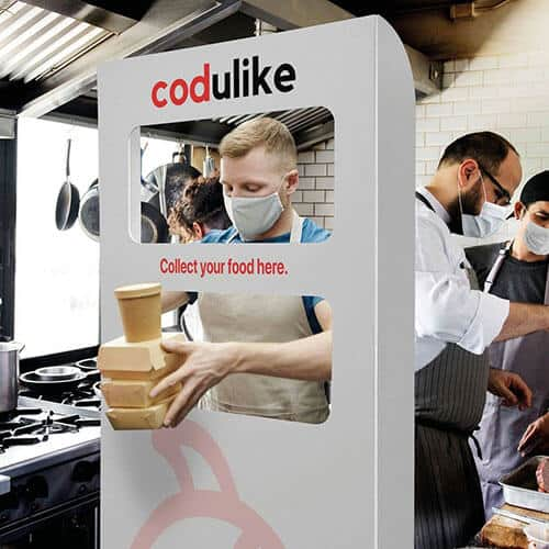 Takeaway Screens
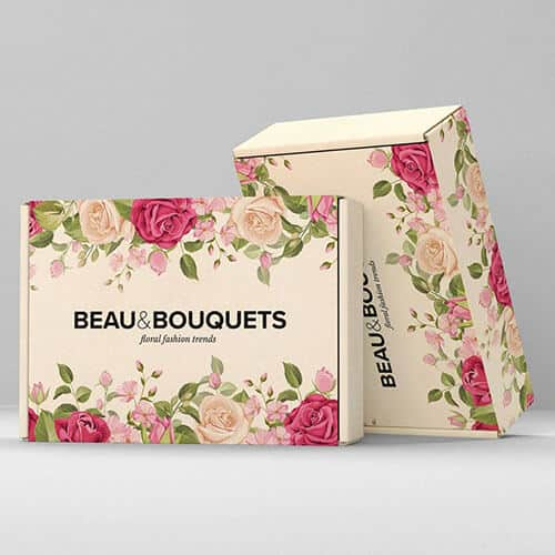 Postal Boxes