Have you ever picked up a flyer or brochure and felt instantly drawn to it, or maybe the opposite, where the text was so hard to read that you just put it down? That’s the power of good typography. It’s not just about choosing pretty fonts; it’s about ensuring your message is clear and inviting.
In this blog, we’ll explore five benefits of high-quality typography in print design and why it matters for your business.
Looking for a printing partner who understands the impact of great typography? Have you checked out our high-quality printing service at Printingprogress Ltd yet? We are experts at making your print materials look sharp and professional.
Call us on 0800 999 1094 or email us at info@printingprogress.co.uk and see the difference quality typography can make!
Printingprogress Ltd — where your brand’s story is told beautifully, one print at a time.
What Is Typography?
Typography is the art and technique of arranging type to make written language legible, readable, and visually appealing. It goes beyond simply picking a font; it involves font selection, size, spacing, layout, and other decisions that impact how your message is perceived.
In print media, where physical space and clarity are crucial, understanding typography design principles is essential to producing effective print design that communicates your brand and message.
The Top 5 Benefits Of Typography In Print Design
Now that you know about typography, here are its five benefits in print design that you must know:
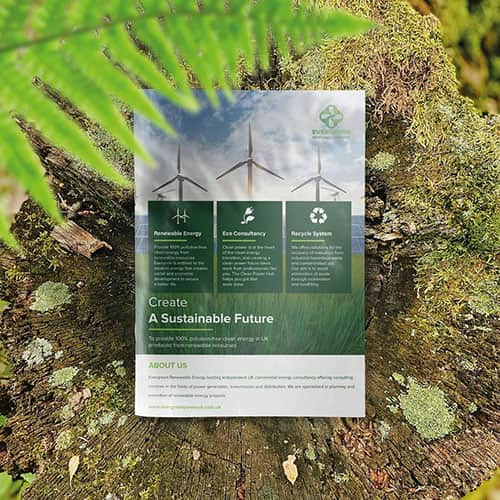
1. Enhances Readability And Legibility
One of the primary benefits of typography in print design is ensuring your content is easy to read. Good typography uses proper font types and sizes, optimal line spacing, and a clear visual hierarchy that guides the reader’s eye through the text. This enhances readability and legibility, making it easier for your audience to absorb information quickly. This clarity is even more critical in print, where the user experience is fixed and cannot be zoomed or adjusted.
2. Establishes Branding Consistency
Consistent use of typography strengthens your brand identity across all print materials. By selecting and applying a cohesive font family and style that aligns with your brand, you create a uniform appearance that reinforces recognition and trust. This consistency is a key benefit of typography that ensures your branding feels professional and reliable, no matter what type of printed collateral you produce.
3. Creates A Clear Visual Hierarchy
Typography controls the flow of information by establishing a clear visual hierarchy. Through font size, weight, and style variations, designers can highlight important headlines, subheadings, and body text, helping readers quickly identify key messages. This principle of typography in print design enhances design clarity and improves communication efficiency, which is essential for marketing materials like brochures, flyers, and posters.
Also Read: Why Effective Design Is Crucial In The Printing Process
4. Improves Overall Communication Through Design
Effective typography transforms mere words into a powerful communication tool. It conveys tone, mood, and emotion, subtly influencing how readers perceive your message. By mastering typography design principles, your print design can communicate more than just information—it can tell a story, inspire action, and evoke feelings. This vital benefit of typography elevates your print media beyond simple text to an engaging user experience.
5. Optimises Layout And Spacing For Better User Experience
Proper layout and spacing in typography prevent overcrowding and ensure your print design is visually balanced. Adequate margins, line heights, and letter spacing create an inviting and comfortable reading experience. These subtle design decisions are essential for maintaining user experience in print, allowing your audience to focus on the content without distraction or fatigue.
So, typography’s benefits in print design include clarity, consistency, and powerful visual impact that truly elevates your brand. For expert design and flawless print execution, trust Printingprogress Ltd to bring your vision to life.
CONTACT PRINTINGPROGRESS
Printingprogress Ltd – Experts Who Understand Typography Design Principles In London
With over a decade of industry experience, Printingprogress Ltd has built a reputation as one of London’s leading print and design specialists. Our team understands that effective typography in print design is more than aesthetics—vital for communication and brand recognition. We apply proven typography design principles to every project, ensuring clarity, consistency, and visual impact.
Whether you’re producing business cards, brochures, or large-format signage, we tailor every design to suit your brand’s voice and message. Our commitment to excellence has earned us multiple awards, including the Muse Creative Award and Business Excellence Awards from 2020 through 2024. From font selection to perfecting layout and spacing, we deliver stunning print materials that elevate your brand in London and the surrounding areas.
Call us on 0800 999 1094 or email us at info@printingprogress.co.uk for expertise, creativity, and print solutions that make a lasting impression.
FAQs
1. What are the best print design tips for improving branding?
Start with typography design principles that reflect your brand’s tone—professional, fun, luxurious, etc. Ensure branding consistency across all print materials using the same fonts, colours, and visual style. Maintain ample white space and keep the messaging clear for maximum impact.
2. Can Printingprogress Ltd help with both design and printing?
Absolutely. Printingprogress Ltd offers an all-in-one solution—from concept to final print. Whether you need logo design, branded clothing, flyers, or corporate gifts, they handle both the creative graphic design process and professional printing, ensuring visual hierarchy and consistency in all your print materials.
3. How does Printingprogress Ltd ensure readability and legibility in printed designs?
By following core typography design principles, Printingprogress Ltd prioritises readability and legibility through brilliant font selection, optimal layout and spacing, and tested visual structures. This ensures your message is clear and compelling in any printed format.
4. What do you mean by Typography design principles?
Typography design principles are the fundamental guidelines for creating clear, readable, visually appealing text layouts. They include font selection, hierarchy, alignment, spacing (kerning, leading, tracking), contrast, and consistency. These principles help designers communicate messages effectively and enhance the user experience, especially in print design.
5. How can I get a custom quote for a print design project?
You can request a quote by calling 0800 999 1094, emailing us at info@printingprogress.co.uk, or using the online contact form. The team will get back to you within an hour during working hours to discuss your needs and provide tailored recommendations and pricing.

 Eco friendly, sustainably sourced recycled FCS certified print
 Takeaway Screens
 Postal Boxes